


Description
Mastering Data Visualization and Animation with Python. This course is a comprehensive and practical program that teaches learners how to design and build dynamic data-driven animations and charts using the Python programming language. The “Mastering Data Visualization and Animation with Python” course is designed to teach participants how to create engaging and dynamic charts so that they can effectively visualize their statistical information. This course teaches learners how to transform static and simple data into animated and narrative images that are ideal for professional presentations and sharing on social networks. The training material is divided into small, understandable sections, and real, fun, and practical data is used in all sessions to make learning an enjoyable experience. Along the way, participants will learn to work with the Jupyter Notebook environment and basic Python concepts without the need for prior knowledge or heavy prerequisites, and even create their first data animation in the first few minutes of the course. At the end of this course, learners will have a set of ready-made and reusable templates that they can use in their analytical projects. This course serves as a complete guide for those who want to strengthen their data visualization skills, build a portfolio, or enter the fields of data science and data analysis.
What you will learn
- Learn how to create beautiful and engaging animations from data to share on social media.
- Starting the process of building a specialized portfolio in the field of data analysis
- How to use the Jupyter Notebook runtime environment in a basic way
- Learning the basic and practical concepts of the Python programming language
- Learn how to convert data in Excel files into fully visualized outputs.
- Access to a set of ready-made data visualization templates for reuse in projects
This course is suitable for people who:
- New data analysts looking to build and develop a specialized portfolio in the field of data analysis
- Data science and statistics enthusiasts who want to improve their visualization skills
- Anyone who wants to improve their Python skills by creating engaging and animated charts
Course details: Mastering Data Visualization and Animation with Python
- Publisher: Udemy
- Instructor: Sjoerd Tilmans
- Training level: Beginner to advanced
- Training duration: 54 minutes
- Number of lessons: 10
Course syllabus in 2024/5
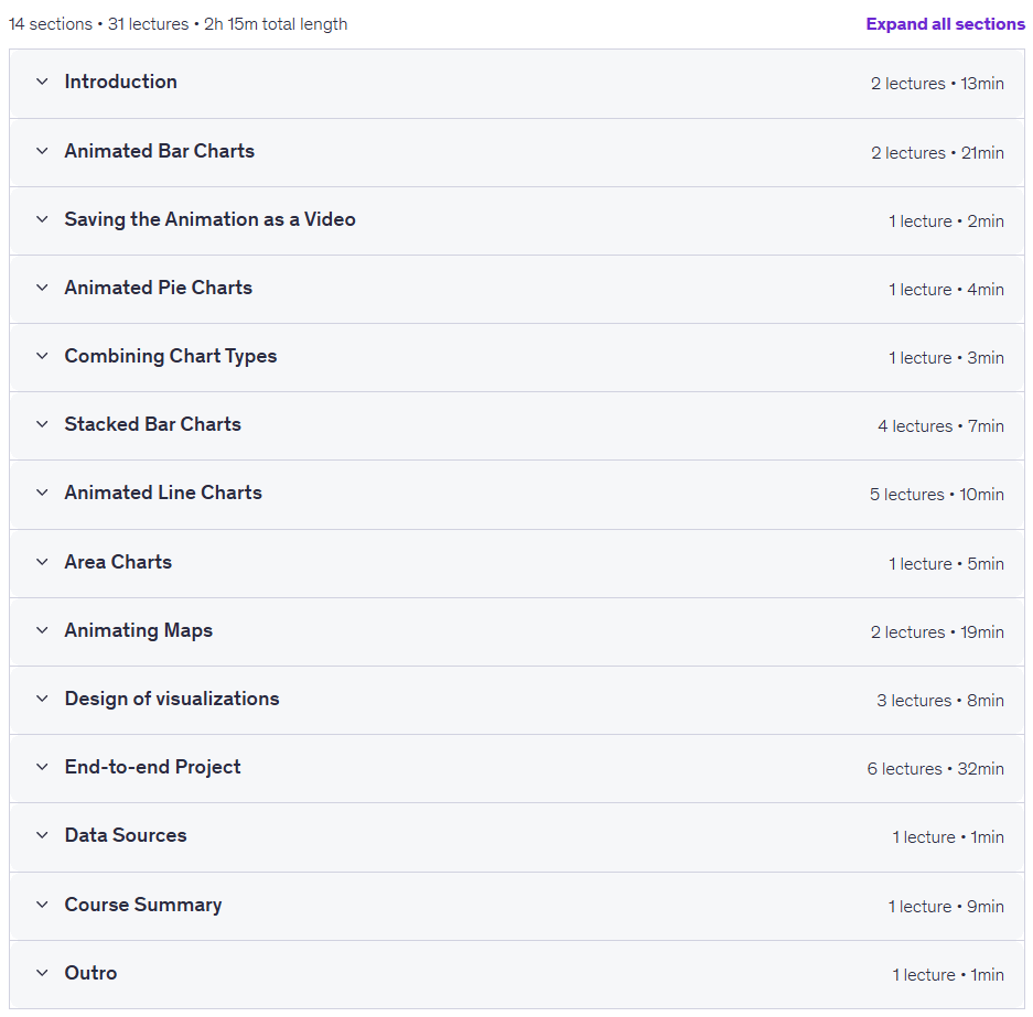
Prerequisites for the Mastering Data Visualization and Animation with Python course
No software needed
Beginner-friendly
All data provided
Course images
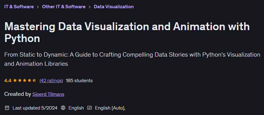
Sample course video
Installation Guide
After Extract, view with your favorite player.
Subtitles: None
Quality: 720p
Download link
Rapidgator link
File(s) password: www.downloadly.ir
File size
376 MB